


 Tweet
Tweet
Hi,
Due to eye disabilities I need to use Windows in high-contrast-mode. Thus my explorer looks this way:

Black window background, white frames, yellow window text, etc.
The UI of the CD Ripper looks this way:

The UI of the Batch Converter looks this way:

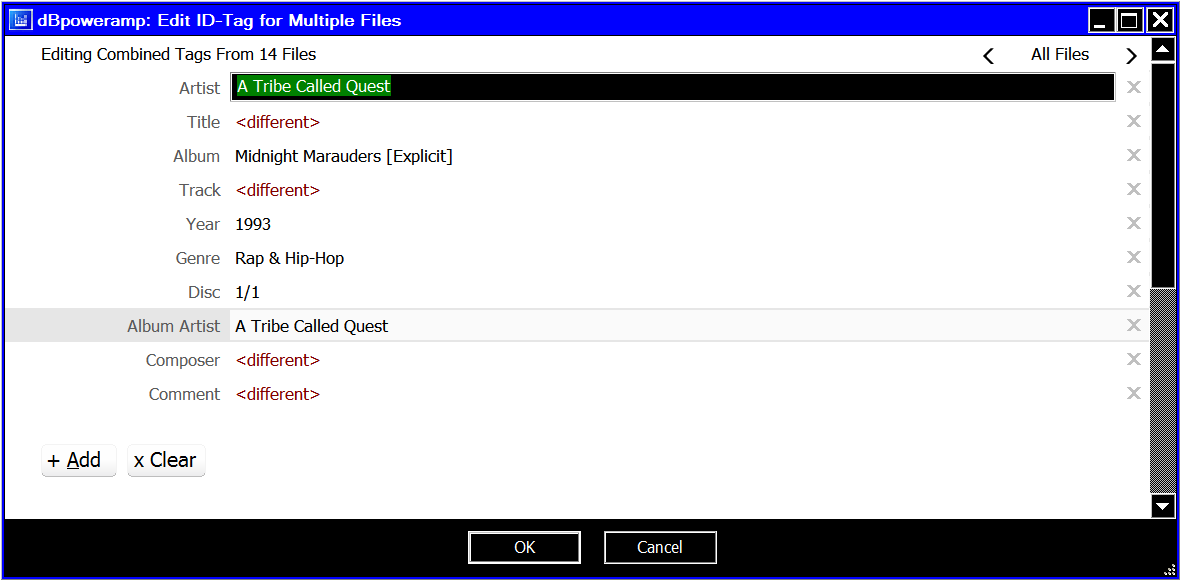
And, yes, the ID Tag Editor looks similar:
Even the property pages in the file properties dialog are wrong colored (ID Tags property page looks like the editor):

With the announcement of R16 and big UI chances/enhancements I really look forward for R16.
Since R16 is running on my desktop, I unhappy to work with this UI, but over the years without any further change I get more and more angry about this well structured (optically), wrongly colored, with not necessarily logical keyboard usage!
There are controls with black in black, yellow on white, mixed black and white backgrounds, drop-downs only showing content in the edit control if activated/focussed, and so on.
I really would appreciate any change to a more consistent UI, that works independently from the system colors or works in case of enabled high-contrast-mode only with system colors (MSDN: mandatory in high-contrast-mode).
Any chance for this big step?
Best regards,
Martin
Due to eye disabilities I need to use Windows in high-contrast-mode. Thus my explorer looks this way:
Black window background, white frames, yellow window text, etc.
The UI of the CD Ripper looks this way:
The UI of the Batch Converter looks this way:
And, yes, the ID Tag Editor looks similar:
Even the property pages in the file properties dialog are wrong colored (ID Tags property page looks like the editor):
With the announcement of R16 and big UI chances/enhancements I really look forward for R16.
Since R16 is running on my desktop, I unhappy to work with this UI, but over the years without any further change I get more and more angry about this well structured (optically), wrongly colored, with not necessarily logical keyboard usage!
There are controls with black in black, yellow on white, mixed black and white backgrounds, drop-downs only showing content in the edit control if activated/focussed, and so on.
I really would appreciate any change to a more consistent UI, that works independently from the system colors or works in case of enabled high-contrast-mode only with system colors (MSDN: mandatory in high-contrast-mode).
Any chance for this big step?
Best regards,
Martin